Let’s get started
Basics – The Homepage

The Asset Hoshi offers a clean interface that is easy to use. The following overview will help you answer any remaining questions about operating it.

In the main menu you will find the most important functions available to you on every page of the Asset Hoshi. You can return to the home page at any time using both the logo and the home button (each framed in brown).
The magnifying glass takes you to the general search. This allows you to search and find items across all folder boundaries.
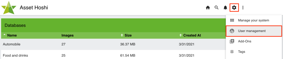
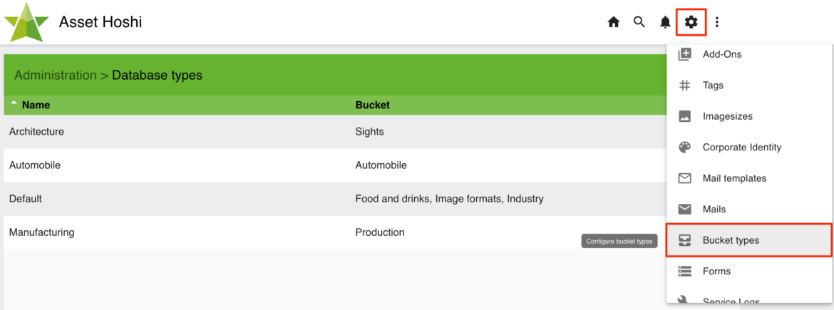
The red framed gear is only visible if you have an administrator role in the system. The button leads to the general settings where you can adjust the profile of the Asset Hoshi, create new users and add forms.
Depending on your role, you can make different settings on the profile page. As the owner you can edit the payment information, change your addon configuration and edit the email settings. All users have the possibility to change their password here, for example. Furthermore, the profile page gives an overview of the roles you have in the respective folders.
You can log out using the dot button on the right of the main menu.
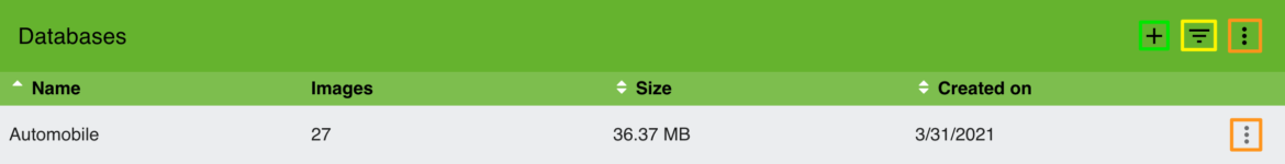
The folder menu is located on the home page just below the main menu. All tables and associated menus are kept uniform in the Asset Hoshi. Therefore, the folder menu with its buttons serves as an example for numerous other menus in Asset Hoshi.
The yellow framed button with three horizontal bars opens a sidebar with numerous filter options for the given table (Filters are an additional addon. Learn more here).
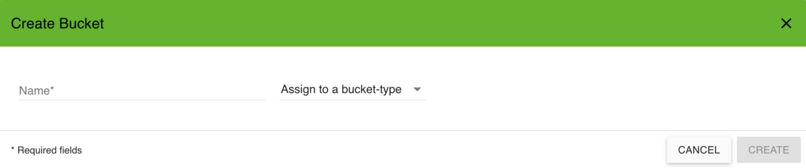
The green framed button (plus icon) opens a context menu for creating a corresponding element.
The three dots (framed in orange) lead to the advanced actions. If the button is located in the menu bar, it can be used to display the recycle bin, publish or move images, among other things. For elements within a table, the advanced actions include displaying, editing and deleting.

The footer menu can be divided into three sections. On the left side there is another context menu (pen, framed in orange). This menu is activated as soon as one or more entries of a table are selected. In the context menu you can perform actions for several elements at once. Among other things, several or all elements can be deleted. The checkbox next to the context menu allows you to deselect or select all elements. If you want to select only single elements, you can either do this by clicking on the button next to the pen or holding down Ctrl or cmd and clicking on them with the left mouse button.
In the middle of the footer menu you can set the number of elements to be displayed on a page (25, 50, 100). The menu to the right can be used to select the corresponding page.
On the right side of the footer menu you can see how many elements are included in the table in total and which elements are currently displayed.
Get started as the owner
As the owner, you are responsible for managing your Asset Hoshi. You have all rights and can design your Asset Hoshi as you wish. There is only one owner in the system i.e. you are the only person who is able to change basic things like payment or addons. You can find the settings directly on your profile page.
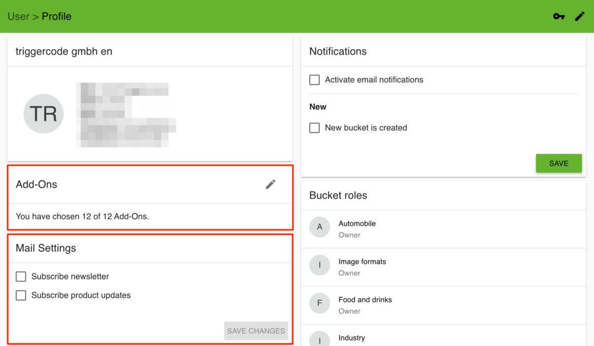
In the left column of your profile page you will find corresponding cards to adjust payments (not shown), change your personal addons or adjust your email settings (each framed in red). In the email settings you have the option to receive the regular Asset Hoshi newsletter with general information. In addition, there are the Asset Hoshi product updates which will keep you informed about the latest improvements your system has received. Both options can be turned on and off at any time.
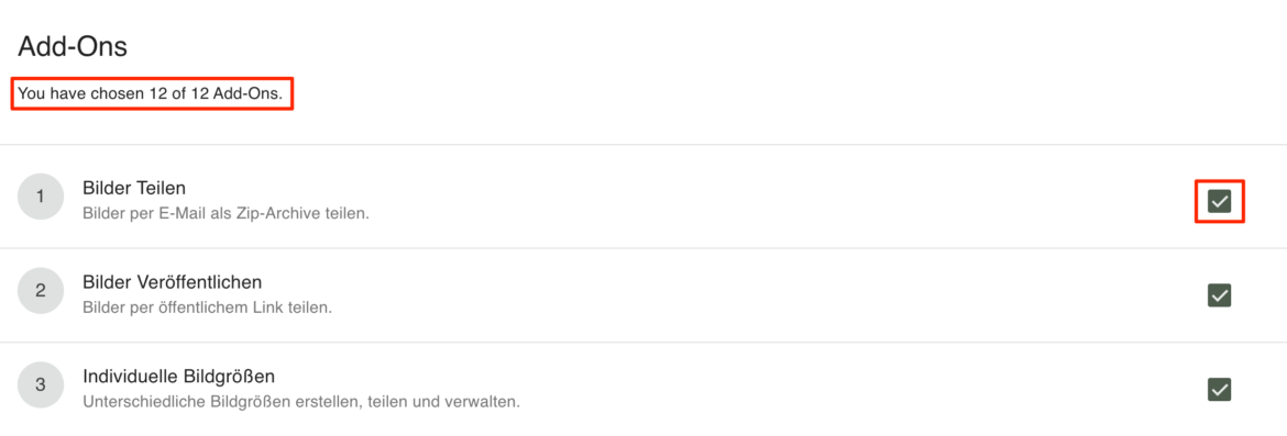
The edit button in the upper right corner of the addon card takes you to the addon overview. Here all addons are listed with a short description. The addons can be exchanged at any time within the scope of the number of addons included in your contract. All you need to do is to check and uncheck the respective checkbox. How many addons have already been selected and how many are still possible can be seen in the display in the upper right corner.
Get started as an admin
As an admin, you have all the options to customize your Asset Hoshi system. The general system administration tasks are an exception. These are exclusively reserved for the owner.
Your role entitles you to view the general settings, for example to create accounts for your employees. To do this, click User Management in the general settings.
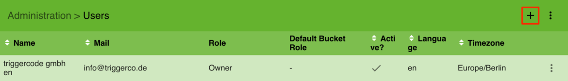
In the user administration you get an overview of all users in your system. You can see at a glance which e-mail address a user uses, their role within the system and the general folder role. The roles/rights can be adjusted via the context menu. The e-mail address of a user is fixed and cannot be changed. The overview also shows whether a user’s account is active or inactive. You can also adjust this in your role as admin. If a user is deactivated, he can no longer log into the system. A simple way to disable a user, should they temporarily leave your company, for example.
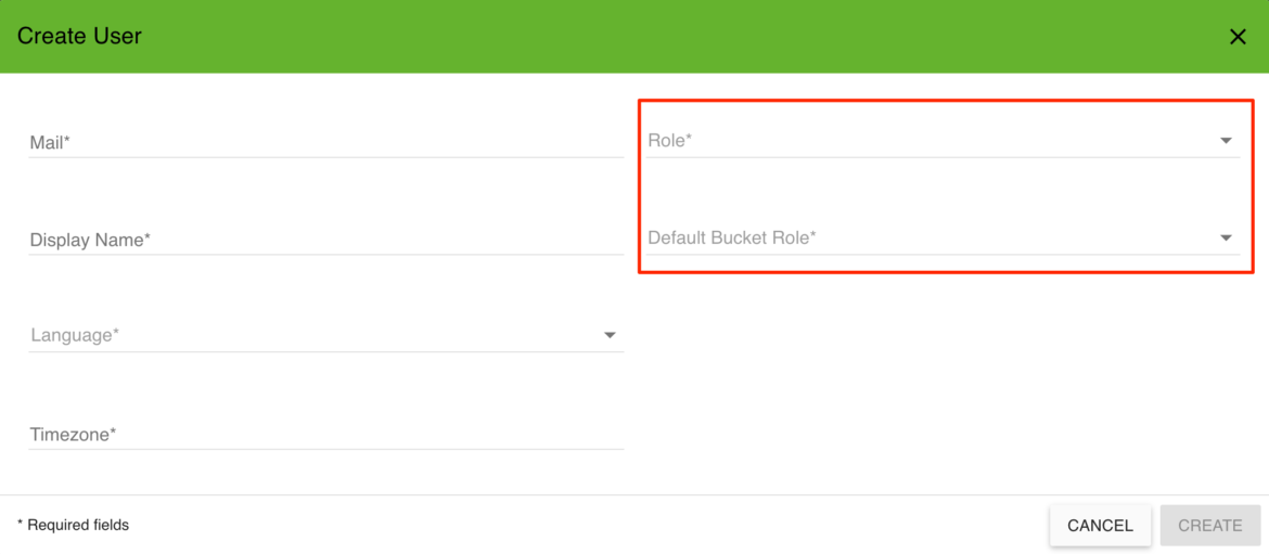
Via the plus button in the menu bar you have the possibility to create a new user. In addition to the general information, you specify the role that your user should receive. The roles available for selection are “Admin”, “Maintainer” and “None”. A maintainer, unlike an admin, does not have access to the general settings. He can create folders and has all options within a folder. If you select “None”, the user does not get a role. He can still be assigned a general folder role. In general: The role “overwrites” the folder role. This means: If a user receives the role “Maintainer”, it does not matter which folder role is assigned to him, because he has all rights for each folder through his role.
The folder roles are “None”, “Reader”, “Writer”, “Editor”, “Admin” and “Owner”. With the role “None” the user has almost no possibilities in the system. A reader can open folders and download items. As a writer you can additionally upload elements initially and edit the form data for the first time. If you have the editor role, you can also edit, publish, share and move items to other folders at any time. An admin can edit the folder settings via the folder menu. Only with the owner folder role, you can delete a folder and transfer folder ownership.
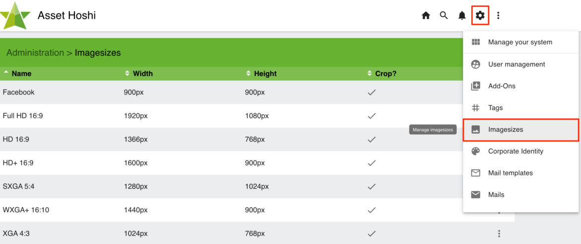
Another one of your tasks is to create and manage the image sizes. These are predefined values in which you can download, publish or share your images. Thus, an image does not have to be cropped first for further use. It is enough to create the image size from the menu and click on the appropriate value, for example, when downloading. This is especially useful if you need a certain image format on a regular basis. When creating an image size, you specify whether an image should be cropped or not. If cropping is enabled, the image will be resized if it has a different ratio than the desired image size. If an image size is not to be cropped, the aspect ratio of the original image is kept and only reduced. In this case, however, the pixel values may differ from the desired values.
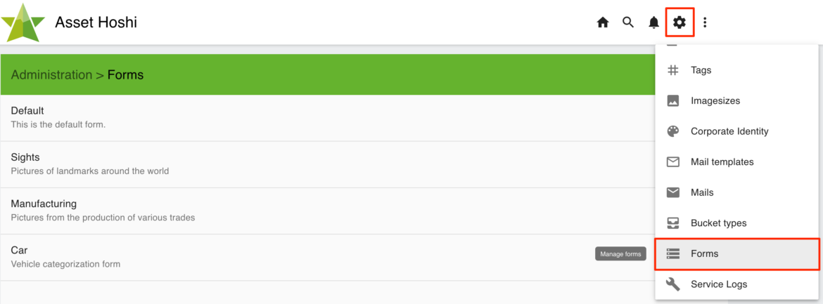
Each folder in Asset Hoshi has a folder type assigned to it. You can also manage the folder types via the general settings. It is used to assign one or more forms to the folder type. Thus, each item in a folder receives the corresponding forms defined by the folder type. In the folder type view you get an overview of the existing folder types and the corresponding folders.
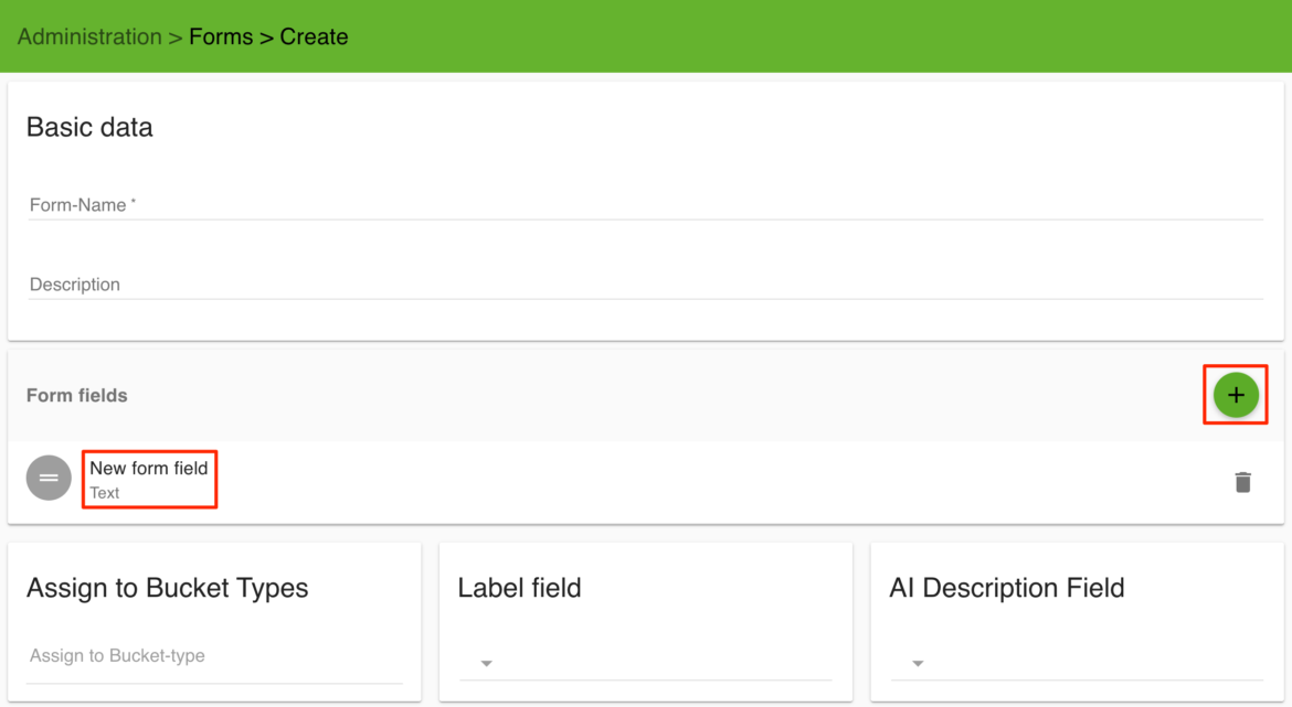
Using the form builder you can create individual forms according to your wishes and requirements. A form consists of several fields. The Asset Hoshi supports different field types. This ranges from a simple text field, radio buttons, checkboxes or selection fields to a date picker. A label can be added to each field. Furthermore, it is possible to declare a field as mandatory. The fields can be arranged flexibly and edited afterwards. Examples for fields could be name, description, source or a reference number, which you add to your elements.
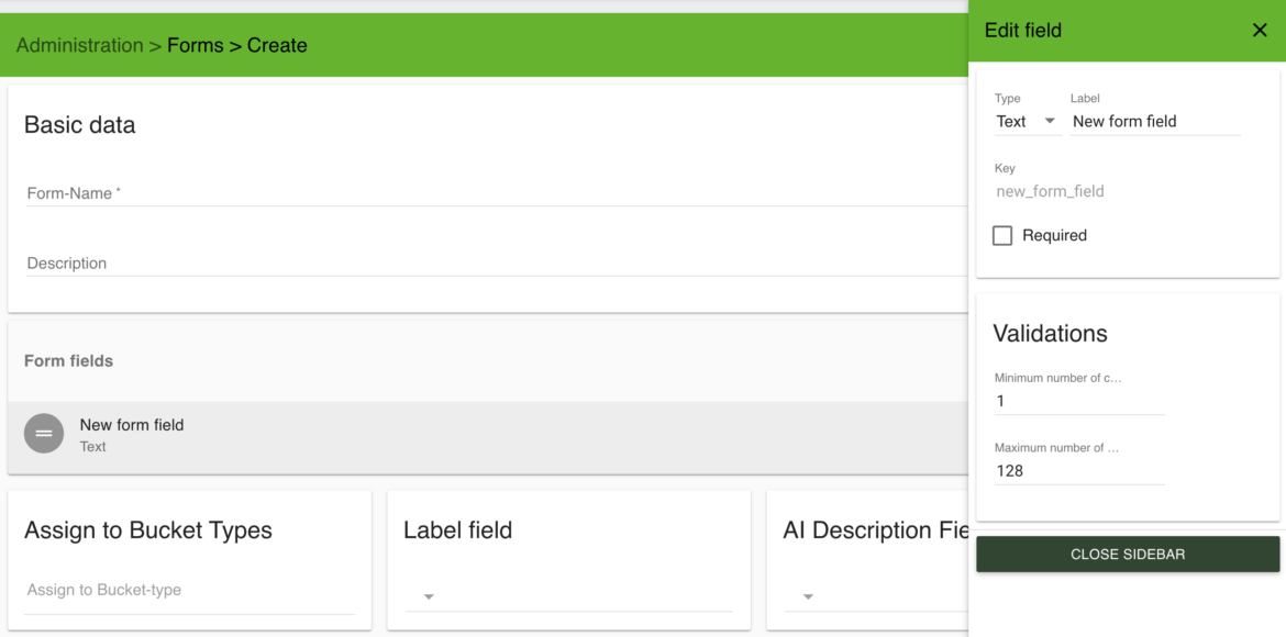
The label field is used to define which field should be displayed when hovering over the respective element in the element overview of a folder. A text field is suitable for this. The AI label field is used to define whether and which field should be automatically filled in by AI tagging.
As already described in the section above, the forms are added to folder types to determine in which folder a form is used. A folder type can contain multiple forms.
Get started as a maintainer/editor
This section is for users who either have a maintainer role or at least have the default editor folder role. A maintainer can additionally create folders. If a user does not have a role but only a folder role, he only has rights within a folder.
To open a folder, there are two different methods in Asset Hoshi. You can reach the folder content via the context menu with the menu item “View”. An even easier way is to double-click on the corresponding folder – similar to what you are used to when navigating on your PC or Mac.
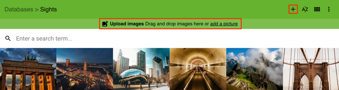
If you want to upload new elements into a folder, there are two possibilities: With the plus button you can select a single element, fill in the form directly and save it. If you want to upload a whole series of elements at once, you can use the drag-and-drop function. Simply place your elements on the small bar below the actual folder menu bar. You can then edit the forms. (Filling out multiple forms of an element at the same time is currently not possible, but is in planning).
If the AI tagging addon is enabled, the elements are automatically tagged and AI-described after uploading. This may take a moment, but should be entered into the form after a few seconds.
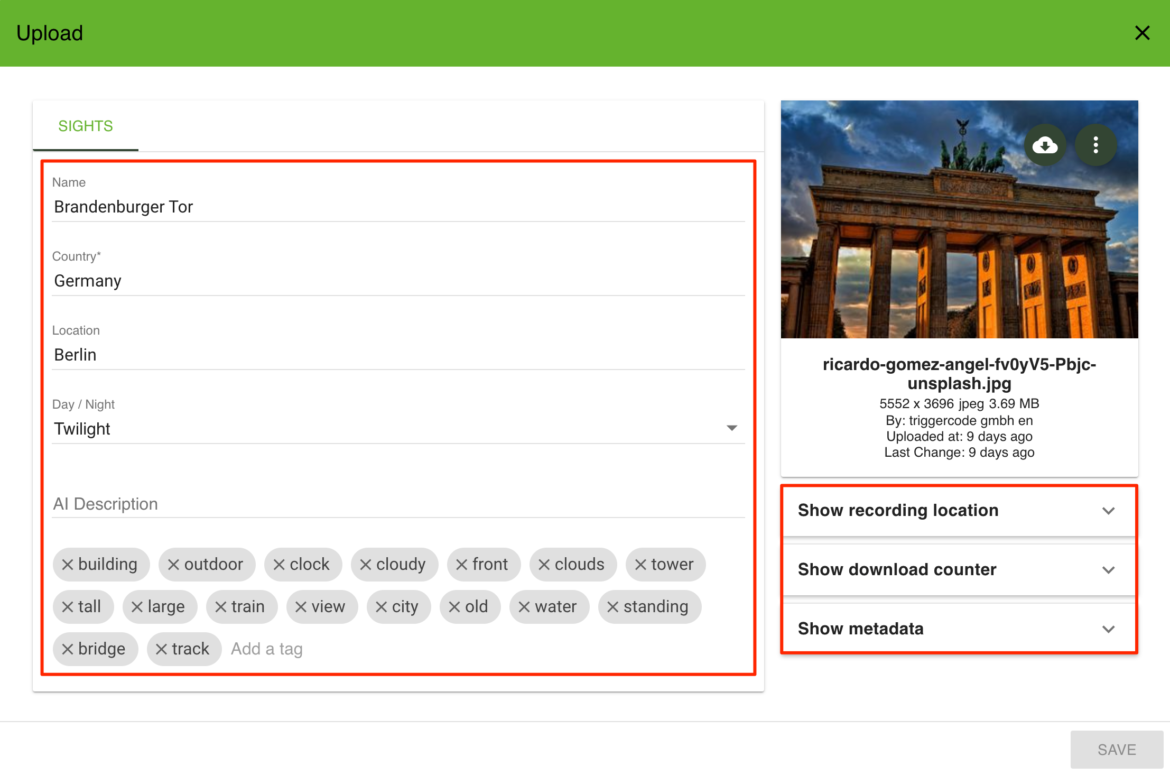
The detail view of an element consists of two columns. The left column contains the form with the tags. If you have activated the AI tagging addon, the tags are added automatically. Of course, you can still edit them yourself afterwards. With the X-button you can delete a tag. With a click on “Add a tag” you can add your own tag and confirm it with the enter key.
In the column on the right side you will find further information panels next to the image preview, which you can unfold. The precondition is that the respective addon has been activated in your Asset Hoshi by the owner. This way, the location where the picture was taken can be displayed on a map. Furthermore, specific download statistics can be viewed as well as meta information about the element. The metadata includes, in addition to generally known information such as format and size, information about the color profile, color space, camera information and GPS data (longitude/longitude). The metadata can be helpful to your designer for further editing, for example.

Buttons are placed on the element in the grid overview as well as in the detail view with which various actions can be performed. The download button is always visible, you can download the element in one of the predefined image sizes. The other actions are hidden behind the three dots in the context menu. For example, it is possible to publish individual elements.
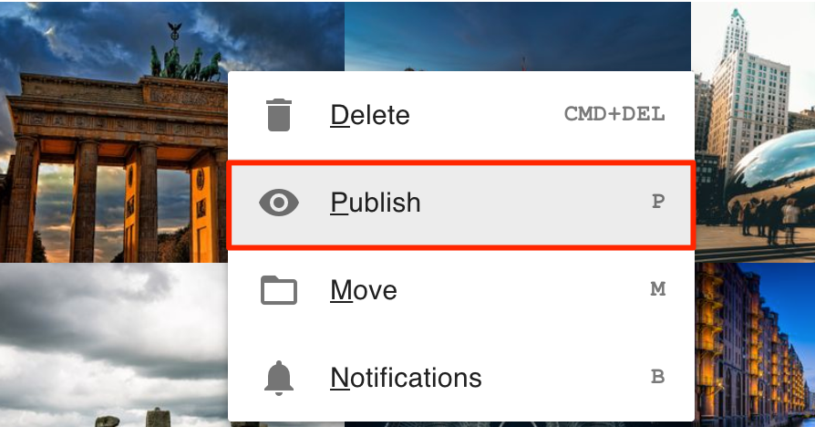

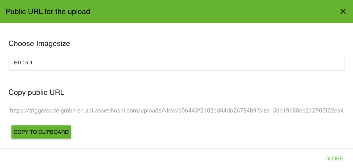
If an image is published in the context menu, another button appears next to the download button. This publish button allows you to share a single item via a link. Similar to the download, an image size is also selected when publishing. Anyone who has the link can access the image. This makes it quick and easy to share a single image or embed it on a web page.
A publication can be undone at any time. The link thus becomes valueless, since the corresponding element can no longer be accessed.

If you want to publish several elements, it is useful to select them with the multiple selection and release them at once. To select an element in the grid view you have to click on the element with the left mouse button while holding down the Ctrl key (Windows) or the cmd key (Mac). The element will be marked as selected by a check icon.
With the selection it is not only possible to release several elements at the same time, multiple elements can also be deleted or moved. To do this, select the recycle bin in the folder menu bar or click “Move” in the context menu.
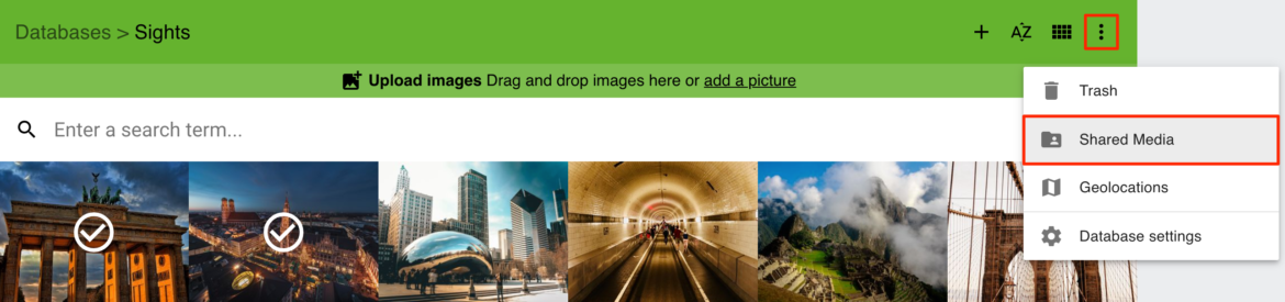
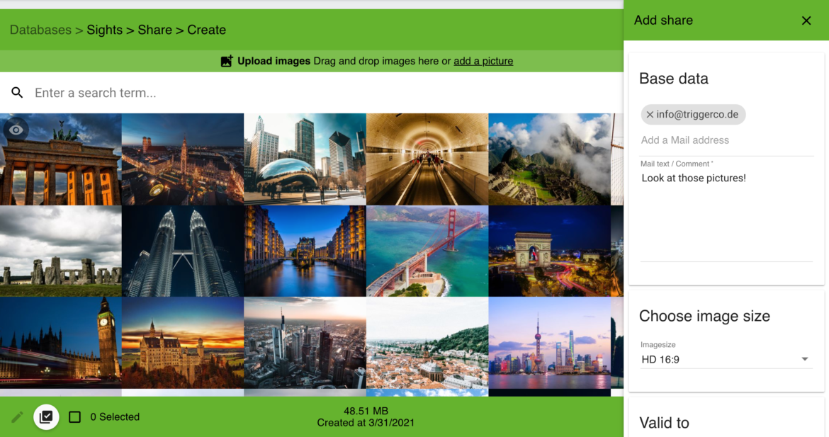
The function for selecting multiple elements is also to be used when sharing images. If you want to share images via email instead of publishing single links you can do so via the corresponding item in the context menu. If the addon is activated, a sidebar opens with which you can view and manage your previous shared content. Sharing new content is possible via the plus button. Images can be shared directly with multiple e-mail recipients. A special feature of sharing is the assignment of a validity date. If the date is exceeded, the link that is sent in the e-mail is no longer valid. This keeps you in control of how long you want to make the content available to someone. The link in the email downloads a zip folder with the corresponding images in the selected size.
Feedback
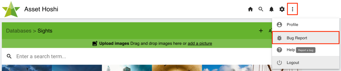
Would you like to contact us? Do you have questions, suggestions or criticism? Then use the feedback button in Asset Hoshi and write a short message to our support team. The feedback button can be seen by every role and it directs you to your email program.